
A boxing king logo can instantly communicate strength, discipline, and championship ambition, but only when the design is built with intention. However, many gyms, boxing promotions, and athletic brands struggle to create a mark that looks powerful at every size. This guide explains how to plan, design, and protect a boxing king logo that resonates with fighters, fans, and sponsors alike. You will learn which visual elements work best, how color and typography shape perception, and what legal steps to take before you launch. Finally, you will see how to test the final result.
Boxing King Logo Essentials: What Makes a Great Design
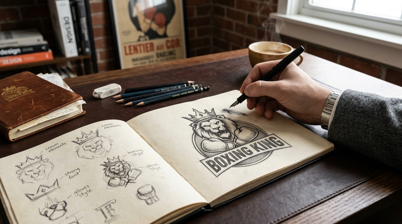
A strong boxing king logo does more than look good. Additionally, it communicates who you are within seconds. First, before you sketch anything, understand what makes a mark work across every format.
Defining the Core Message of a Boxing Logo
Start with one clear idea. Your logo should answer a simple question: what does this brand stand for? Common answers include power, discipline, speed, or community.
For example, a gym focused on youth training might emphasize discipline and growth. Similarly, a boxing apparel label might prioritize confidence and heritage. Each choice shapes the symbols, shapes, and colors you use.
Tip: Write three words that describe your brand. Therefore, use those words to guide every design decision.
Why Scalability Matters for Gloves and Avatars
A logo must work at every size. It appears on gloves, hoodies, banners, and tiny social media avatars. Therefore, simplicity is essential.
Test your design with these checks:
- Is it recognizable at 32 pixels?
- Does it work in a single color?
- Does it stay sharp when embroidered on a glove strap?
- Does it hold up on both light and dark backgrounds?
Fine lines and small text often disappear at small sizes. In contrast, bold silhouettes and thick shapes survive scaling. As a result, your mark stays recognizable everywhere your audience sees it.
Common Mistakes That Make Boxing Logos Look Generic
Many sports logos look alike. A few habits cause this problem.
- Relying on clichés: Crossed gloves, generic boxers, and default belts appear in countless designs.
- Overcomplicating the layout: Too many elements compete for attention.
- Following passing trends: Heavy gradients and drop shadows age quickly and often fail in print.
- Ignoring the audience: A logo for competitive fighters should feel different from one for fitness beginners.
Instead, add one distinctive detail. For example, a subtle crown integrated into a glove silhouette feels familiar yet memorable.
Core Design Elements for a Champion-Level Mark
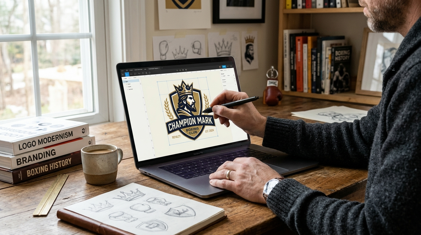
A strong mark depends on a few core elements. Additionally, these elements communicate authority, energy, and trust at a glance.
Using Crowns, Belts, and Gloves as Symbols
Motifs tell viewers what your brand stands for. Each boxing icon carries a clear message:
- Crowns suggest dominance and royalty, which fits a “king” theme.
- Championship belts signal winning and prestige. A simple belt outline reads faster than a detailed one.
- Boxing gloves communicate sport, effort, and combat. Gloves work best as bold silhouettes.
Choose one primary motif. For example, a single crown above a glove keeps the design focused. Moreover, adding three or four symbols usually creates clutter that weakens recognition.
Shape Language: Shields, Badges, and Circular Emblems
Shapes shape perception. Shields suggest protection and strength. Badges feel official and earned. Circular emblems create unity and a sense of completeness.
- Shields suit gyms and training academies that emphasize discipline.
- Badges fit event promotions and amateur leagues because they resemble awards.
- Circles are versatile. Likewise, they work well on apparel, stickers, and social media avatars.
Consider how the shape pairs with your name. In addition, a wide wordmark often looks better inside a horizontal badge than a tall shield.
Balancing Detail With Simplicity
Detail adds character. However, too much detail fails when the logo shrinks to favicon or embroidery size. Thin lines disappear, and small text becomes unreadable.
Follow these practical rules:
- Test at small sizes. View the mark at 16 pixels and at one inch wide.
- Limit line weights. Keep strokes thick enough to survive printing and stitching.
- Reduce colors. Two or three colors usually reproduce cleanly.
- Remove fine textures. Gradients and shading often break down on merchandise.
For example, a glove silhouette with bold negative space outperforms a glove covered in stitching details. Therefore, build the simplified version first. As a result, you can add optional detail for large-format uses like banners and signage.
Color Psychology in a Boxing King Logo
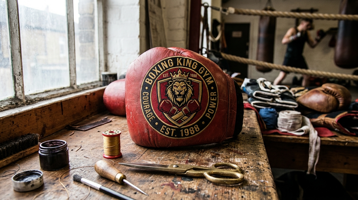
Classic Combat Sport Colors
Red, black, and gold have long defined combat sports. Each color carries a clear meaning:
- Red signals energy, courage, and aggression.
- Black suggests power, discipline, and authority.
- Gold represents victory, prestige, and championship status.
Thus, these colors tell viewers that a brand takes competition seriously. A gym logo that pairs black with gold instantly feels like a title belt. However, avoid giving all three colors equal weight. Choose one dominant color and use the others as accents.
Contrast for Legibility
Contrast determines whether your mark works in real life. For example, a design that looks sharp on a white website can disappear on a dark gym wall. Therefore, test your logo on both light and dark backgrounds before you finalize it.
Follow these practical steps:
- Use gold or white on black for dark backgrounds, such as apparel or arena signage.
- Switch to deep black or deep red on cream or white for print materials and documents.
- Check contrast ratios. Aim for at least 4.5:1 for any text within the mark.
- Print a small test. Confirm the design stays readable at one inch wide.
Building a Consistent Palette for Your King Logo
A limited palette strengthens brand recognition. For instance, most successful brands rely on two or three core colors. In addition, they add one neutral, such as charcoal or white, to create breathing room.
Consistency matters across every channel. Your social media avatar, merchandise, event banners, and website should all use identical color values. As a result, fans recognize your brand within seconds.
Best practices for color consistency:
- Define exact codes for HEX, RGB, CMYK, and Pantone.
- Create a one-page brand sheet for designers and printers.
- Avoid introducing new accent colors every season.
Typography and Symbolism Choices
Bold Display Fonts Versus Custom Lettering
Typography sets the tone before viewers read a single word. Boxing brands often rely on heavy, aggressive letterforms. The real decision is whether to use a ready-made font or custom lettering.
Bold display fonts are fast to deploy and cost less. They work well for startups testing a concept. Condensed block typefaces, for example, communicate speed and power quickly. However, the drawback is that many competitors may use similar styles.
Custom lettering offers full ownership. For example, a designer can shape each letter around a unique idea, such as a sharp italic cut or a notched stroke. As a result, the mark becomes much harder to copy.
Tip: Start with a licensed display font, then modify it. Adjust the kerning, reshape the terminals, or cut a small detail into the letters.
Pairing a Wordmark With an Icon in Your King Logo
A wordmark uses only text. An icon uses only a symbol. Thus, combining both gives your brand more layout options.
Consider these common arrangements:
- Horizontal lockup: The icon sits beside the name. This suits website headers and email signatures.
- Stacked lockup: The icon sits above the name. This works well for apparel, posters, and event banners.
- Icon-only mark: The symbol stands alone. Use it for social avatars, gym equipment, and app icons.
Icons must remain clear at small sizes. Test your symbol at 16 pixels. If details disappear, simplify the shape.
Symbolism That Signals Strength
Symbols communicate meaning faster than words. Common boxing motifs include gloves, crowns, belts, and rings. For instance, a crown suggests a champion. Similarly, a glove signals the sport directly.
Choose symbols that match your brand promise. Avoid clichés, however, because many boxing brands already use crossed gloves. Instead, try an abstract element. For instance, a crown formed from negative space inside a letter feels more original.
Avoiding Overused Fonts That Dilute Identity
Some typefaces appear everywhere. Popular free fonts often show up in dozens of gyms and sports brands. When audiences see them repeatedly, they struggle to remember any single name. As a result, the brand blends into the crowd.
To avoid this problem:
- Search major logo and stock sites to see how often a font appears.
- Review competitor logos within your niche.
- Confirm the font license allows commercial logo use.
- Modify letterforms to create visual distinction.
In addition, check licensing carefully. Some free fonts restrict commercial use, which could create legal issues later.
Quick Typography Best Practices
- Limit the design to two typefaces at most.
- Keep letter spacing consistent across the wordmark.
- Test the logo in black, white, and grayscale.
- Confirm readability at both large and small sizes.
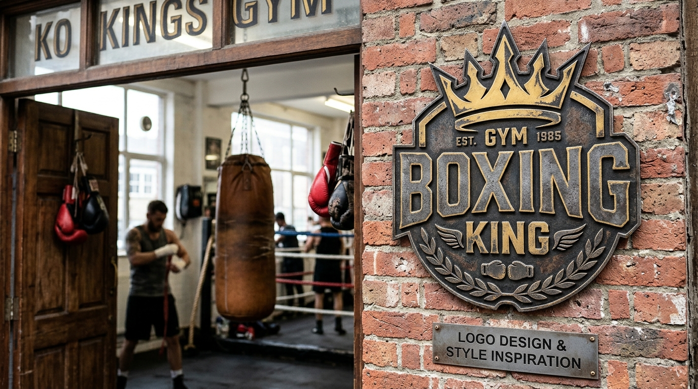
Boxing King Logo Examples and Style Inspiration
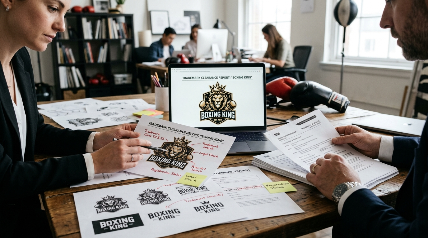
Strong logo examples reveal which visual styles work in boxing. Studying them helps you choose a direction before you start sketching. Every effective boxing king logo begins with a clear style choice.
Vintage Arena Posters and Retro Badges
Vintage designs remind fans of boxing’s golden age. Old arena posters used bold display type, halftone textures, and limited color palettes. Meanwhile, retro badges add heritage through shields, circular crests, and ribbon banners.
For example, a mark might pair a weathered serif wordmark with a crown above crossed gloves. This combination signals tradition and authority.
Tips for vintage styles:
- Limit your palette to two or three colors for an authentic print feel.
- Add texture sparingly so the mark stays readable at small sizes.
- Use a shield or circular badge to frame the symbol.
Modern Minimalist Boxing Logos for Fight Brands
Contemporary fight brands often prefer clean, simple marks. Minimalist logos rely on strong silhouettes instead of fine detail. As a result, they perform well on apparel, social avatars, and mobile apps.
A common approach uses a geometric crown or a glove outline built from clean lines. Negative space can reveal a second symbol, such as a jab arrow hidden inside the glove. Moreover, simple marks reproduce cleanly in one color, which lowers printing costs.
Adapting Inspiration Without Copying Trademarks
Inspiration is valuable. However, copying creates legal and branding risks. Therefore, study references for mood and structure, not for specific shapes or symbols.
Follow these steps:
- Define the feeling you want, such as power, speed, or prestige.
- Collect five to ten references from different eras and sports.
- Note shared traits, like bold contrast or symmetrical layouts.
- Sketch original forms that express those traits in your own way.
- Run a trademark search before you finalize the design.
In addition, combining two styles often creates something unique. A retro shield paired with minimalist line work is one example. The result feels familiar yet distinct.
Avoid tracing stock icons, reusing famous championship belt designs, or mimicking a rival promotion’s mark. As a result, you reduce the chance of takedown notices and customer confusion.
Trademark and Legal Considerations Before You Launch
Before you finalize your logo, confirm that no one else owns a conflicting mark. A legal problem after launch can force an expensive rebrand. Thus, this section covers the key steps to protect your identity.
Running a Thorough Knockout Search
A knockout search is a quick screening of existing trademarks. It identifies names and designs that could conflict with yours in your industry.
Start with these sources:
- The USPTO’s official Trademark Search tool: Search federal U.S. registrations and pending applications.
- State trademark registries: Many states maintain their own databases.
- Search engines and social media: Look for businesses using similar names in boxing, fitness, or sports apparel.
- Domain and app stores: Check whether similar names already operate online.
For example, a gym called “Ringmaster Boxing” might discover an existing registration for “Ring Master” in fitness apparel. That conflict could block approval.
Compare names across three dimensions: sound, appearance, and meaning. Names that sound alike can still conflict, even when spelled differently. Therefore, search phonetic variations too.
Understanding Trademark Benefits for Your King Logo
Registration gives you exclusive rights to your name and logo within your product categories. Without it, you may still have limited common law rights from actual use. However, those rights usually apply only to your local area.
Registration offers several advantages:
- Nationwide priority over later users in the United States
- Legal grounds to stop copycats and counterfeit merchandise
- A public record that discourages competitors
- The ® symbol, which signals official protection
Meanwhile, use the ™ symbol while your application is pending. Only use ® after the registration is approved, because misuse can create legal complications.
Protecting Both the Name and the Artwork of Your Boxing Logo
Trademark protection can cover both your brand name and your visual design. A word mark protects the name in any font or style. For example, a design mark protects the specific artwork, such as your fist, crown, or emblem.
Many brands file both. As a result, competitors cannot copy your name or your visual identity without facing legal action.
When to Consult an Intellectual Property Attorney
You can file a basic application yourself. However, certain situations call for professional help.
Consider hiring an attorney when:
- Your search reveals marks similar to yours
- You plan to expand into international markets
- Your name relies on common words that are hard to protect
- You receive an office action or opposition from another party
An attorney can assess the risk of confusion and draft a stronger application. In addition, they can advise on filing strategy across different countries. However, this information is general, not legal advice, so verify your specific situation with a qualified professional.
Final Checklist and Next Steps
Before you launch, run your design through a final review. A mark that looks strong on a large monitor can fail everywhere else.
Test Your King Logo Under Real Conditions
Stress-test the mark in the places where people will actually see it.
- Grayscale test: Convert the logo to black and white. If shapes blur together, increase contrast or simplify details.
- Small-size test: Shrink it to 16 pixels for favicons and social avatars. Confirm that letters and icons stay readable.
- Apparel mockup: Place the logo on a black tee, a white hoodie, and a gym bag. Look for thin lines that disappear in screen printing or embroidery.
For example, a glove icon with hairline outlines often turns into a blob at favicon size. Instead, thicker strokes usually fix the problem quickly.
Gather Feedback From the Boxing Community
Athletes, coaches, and fans notice things designers often miss. Their reactions show how the mark feels in a gym or arena.
- Ask coaches whether the design suggests discipline and strength.
- Show athletes the logo on training gear and ask what it communicates.
- Survey fans with two or three options. Track which version they remember after five seconds.
Look for patterns. If several people mention the same confusion, revise the design. However, do not change the logo for every individual opinion. Consistent feedback matters more than personal taste.
Document Your Boxing Logo Brand Guidelines
Guidelines protect your investment. Additionally, they keep posters, uniforms, and social posts consistent over time.
Your brand guide should include:
- Primary and secondary versions of the mark with approved layouts
- Color codes in HEX, RGB, and CMYK formats
- Approved fonts and minimum text sizes
- Clear space rules so the logo never looks crowded
- Misuse examples, such as stretching, recoloring, or adding effects
Store the files in a shared folder. As a result, every designer, printer, and sponsor works from the same source.
Next Steps After Your Checklist
Once testing and feedback are complete, export final files in vector formats such as SVG, AI, or EPS. Finally, check trademark availability and secure matching domain names and social handles. Consequently, your brand stays protected across every channel.
Ready to put your identity to work? Get started today.
Thank you for reading our guide about boxing king logo.
Frequently Asked Questions
What makes a boxing king logo effective?
An effective boxing king logo starts with one clear message. Before you sketch anything, write three words that describe your brand, such as discipline, power, or community. Those words should guide every decision about symbols, shapes, and colors. The design also needs to work at every size, from a tiny social media avatar to an embroidered glove strap. Bold silhouettes and simple shapes survive scaling, while fine lines and small text often disappear. Finally, add one distinctive detail, such as a subtle crown integrated into a glove silhouette. This keeps the mark familiar yet memorable, rather than generic.
Which symbols work best in a boxing king logo?
Crowns, championship belts, and boxing gloves are the most common motifs, and each sends a distinct signal. A crown suggests dominance and royalty, which fits the “king” theme directly. A belt outline signals winning and prestige, and a simple outline reads faster than a detailed one. Gloves communicate sport, effort, and combat, and they work best as bold silhouettes. Choose one primary symbol instead of combining three or four, since multiple icons usually create clutter that weakens recognition. For example, a single crown placed above a glove keeps the design focused and easy to recognize.
How do colors and typography shape the perception of a boxing logo?
Color and typography strongly influence how viewers feel about your brand. Colors carry emotional meaning, so choose hues that match the message you defined earlier, such as deep reds for intensity or golds for championship prestige. Test each color in a single-tone version to confirm the mark still works without them. Typography should be bold and legible at small sizes. Heavy, clean letterforms usually outperform thin, decorative fonts on gloves, banners, and apparel. Pair the wordmark with the shape carefully, since a wide wordmark often looks better inside a horizontal badge than a tall shield. Avoid trendy gradients and drop shadows, which age quickly and often fail in print.
What legal steps should I take before launching a boxing king logo?
Before you launch, check whether your logo or name conflicts with existing trademarks. Search official trademark databases in your country and review sports brands, gyms, and promotions that use similar crown or king imagery. Generic motifs like crowns and belts are common, so you may need a distinctive combination to stand out legally. If your design is original, consider registering it as a trademark to protect your brand identity from copycats. Keep records of your design files and creation dates as proof of ownership. Consulting an intellectual property attorney is wise before investing heavily in merchandise, signage, or sponsorship materials, because rebranding after launch can be costly.
Leave a Reply